Synopsis

Fast Money is an allegory of the constant struggle of the two main opposing factions on Wall Street played out in a game of football.

Tuesday, January 24, 2012

Build Build Build

Yes. It’s been a while since I posted last, but that does not mean that I haven’t been working on the project. It just gets a little hard when I’m also doing paid client work. Paying the bills takes priority over my personal wants... sometimes.

So I started building the characters in 3D, starting with the bear character. Originally I was going to build it in 3DS Max and do some touch-up work in the sculpting program Mudbox. 


I started out with a box and...


started pushing and pulling points until...


I got a shape that resembled something like my bear character. 


The only problem with this method, for me, is that this process takes a bit of time to get a good representation of what I wanted. With so much time being spent getting the proportions correct and looking somewhat decent, I soon found myself getting bored and loosing the energy of the characters. So I scrapped the model I made and started from the beginning, working directly in the sculpting program. 


This was a fantastic thing for me because I got the look and the feel of what I wanted in only a few hours instead of a few days with the other method. 


Instead of dreading the work, I found myself looking forward to sitting down...


and putting more detail into the models. 


I had to be careful, however, 


because these characters are not supposed to be too detailed. For the look I’m going for, they need a bit of softness. 


I can see myself using this method of building characters in any future projects that I have. 


It’s just too fun.


More to come.

Tuesday, July 12, 2011

Drawn and Quartered

Yup. It’s been a while since my last post. Balancing work with everything else leaves me little time to work on my project. Even though I missed my original deadline, I still plan to finish everything by the end of the year. I couldn’t stop, even if I wanted to. I’m a bit obsessive in that way.

Since I have the action mapped out with the animatic and the pre-viz, the next thing that I needed to do was to figure out what these characters looked like. 


So I sketched out drawings for both the bull and the bear character.
I’ll use these sketches as a guide when I build the 3D models. 

There’s, of course, going to be some changes when these are finally built but the overall look and feel
should be very close.


I wanted to sketch out the characters so I could see what they looked like at different angles. I also wanted the drawings to be consistent. In order to do this, I used a stand-in that I could turn in different directions and use to help me keep the size of my characters the same at every turn. Traditionally, artist would use a wooden mannequin to aid with poses and perspective.


In this case I decided to use a digital version of the mannequin. I opened my 3D application and placed the mannequin in the scene and posed it according to how I wanted to draw my characters and then I placed a camera on a circular path around the mannequin and then rendered or took a snapshot for each angle


I then took all of those frames into Photoshop and lined up the actors and arranged them on their own layer.


I then dimmed that layer so that I could sketch my characters on top. 


Then I turned off the mannequin layer and then colored in the lines of my sketch. I did this with both the bull and the bear layer.


More to come.

Tuesday, March 29, 2011

Pre Viz

So here is the pre visualization or previz of the animation. It took a little longer for me to finish things than I world have liked because paid work takes precedence over personal work, but I was still able to get quite a bit of work done in between my assignments.


Creating the previz is helpful because it more closely represents the finished product than the animatic does. The camera movement and general pacing and overall timing of the previz will be used in the final.
I wanted to try to make the camera movements and actions exciting, but still keeping certain limits on its movements. To do this, I looked at examples that I found online of different action spots and I took the elements that I liked the most and incorporated them into my animation.

As you can see, the characters in this animation are blocky and stiff representations of what is to come later. This has many benefits. It allows you to concentrate on the overall action without getting bogged down in the detail. Later, I can replace these blocky representations with fully animated and refined characters. Also using the blocky characters lets me quickly change position and timing if I feel that something will work better a different way. I have not committed to a look so I’m free to experiment a bit.


Creating the players was straight forward. I started with a box and pushed and pulled parts of the box 


until I got the finished shape of one of the players. To get the other player, I just took the same shape and put on a different head. At this stage, they don’t need to look perfect. 


Once I had my players made, I placed them in the scene and I animated them and the cameras based on the animatic and storyboard.


You may notice that some elements have been changed from the animatic. That’s because in the animatic, you can draw things in a way that would not work well when you finally made everything 3D so elements had to change camera angles had to change and whole scenes had to be cut or added to help things flow properly.

Now that this step is completed, the next things I need to tackle are the character designs. In the coming weeks, I’ll be posting drawings of what I think these characters should look like. There are about six to eight unique characters that I need to figure out.


More to come.


Friday, January 21, 2011

It's better to look good than to feel good. ;)


So the question is “What is this thing supposed to look like when it’s done?” Well the short answer is “I don’t know.”  
 I mean, not really. Yes, I am the one creating this animation so I should know exactly what is going to come out, and that is true to a point. I’ve been doing this for a while and I know what I’m capable of but there are always other factors that can influence the direction of the final piece. For me, there is always a bit of uncertainty that goes along with my projects. This is why doing all of these steps is necessary for me. It helps flesh everything out. It’s like doing a sketch before actually painting a portrait. There needs to be some guidelines to keep me on track and moving toward a desirable outcome. That’s why I created the storyboards and then the animatic and now the previz, which should be done in a couple of weeks. They all help me solidify the vision I have in my head.
Something else that helps me decide the final look and feel of the animation is looking at other artists work for inspiration. There are so many resources everywhere that I can look at to help me in developing the final look.
One thing I know that I want is a painterly or illustrative quality to this animation. To do this in 3D is not that easy to do well, so I may be painting myself into a corner with this one, but I know what I want and having a painted look to the moving elements is definitely what I want. To that end, I’ve been looking at a few artists and works that come closest to what I want to achieve. 


Justine Bua is a New York artist and his work, for me, really captures the feel of the city. 


His choice of colors and the sense of atmosphere that he achieves in his work is something I want to have in my animation. 


The distorted view kind of gives the impression that you’re looking at life through a drug haze. 


Actually he mentions in his book “The Beat of Urban Art” that, at certain times in his career, he was very high when he was painting so I guess that makes a lot of sense.


The work of Dawud Anyabwile, the creator of the “Brotherman” comic, is another artist whose style I’d love to incorporate. The way he draws his characters is fantastic. 


There is a lot of energy in his images, even in the standing poses, and the exaggerated body parts are something that I will incorporate into my characters.


 “Around the Corner” is a short illustrated story drawn by Robert Mackenzie. I love the rough but soft look of his images. 


He’s another artist who I think has very good control of his color palette. I believe I can find a way to bring some of that quality to my work.


Daniel Merriam’s work is a lot more controlled than the other examples I’ve given. It almost seems to me that he’s making an architectural drawing with how precise his lines are. 


I’m not going for this look for this animation, but I do like how he uses color. It’s very subdued and almost monochromatic with a little boldness here and there to keep your attention.


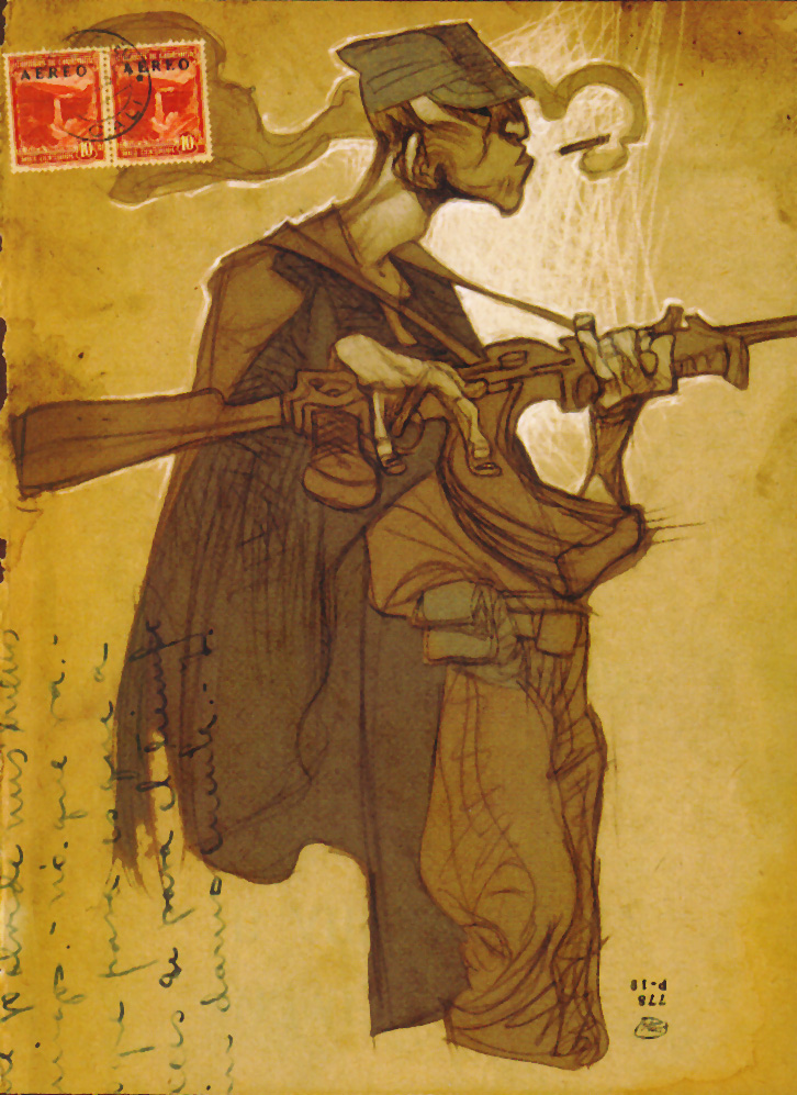
This last image is from a short illustrated story called “Silent Echoes” and is made by Daniel López Muñoz. I love how free he is with his lines. I don’t know if I can incorporate this style, but I would like to try.


So this is my challenge. Trying to make an animation that incorporates all of these aspects into one. 

Maybe I should have tried to do something easier like wrestle bears or something.


More to come.


Tuesday, January 4, 2011

Animatic

So here is the animatic that I was talking about earlier. 


As you can see, it’s just like the storyboard but with movement. This is the reason why I created the storyboard with layers. So it would be easy for me to move the individual elements. It may not be clear why anyone would want to do this step, especially if the final piece is going to be in 3D but I think it’s important because it allows me a chance to see if the story moves along in the way that I expect without spending so much time building complex models. It’s much easier to work out certain things at this stage and, if I need to, I can cut out certain sections that I don’t think work as well and put in others very easily. The time I spend on this stage is minimal compared to the other stages. Some of the cuts may look a little odd, but they represent the camera swinging around to a new location and not a jump cut.


Even though the animatic is not that impressive to look at, there are still a few technical things that I’d like to talk about that made my job a little easier. 


One of the things that I used a lot was something called expressions. For those that are not familiar with it, expressions are a way of making changes, over time, with math. I know many people that do what I do who thought they would never need to know any math if they stuck with art as a career. Unfortunately for them, they were wrong. The good thing is that a lot of the math that is needed is pretty basic and formulas can be found everywhere on the internet and in books and also in the software itself, making life easier. For my part, I used an expression that made objects wiggle. It wasn’t that important for the animatic, but I figured that if I have to look at something, I want it to wiggle.


Another tool that I used was something called a mesh deformer. In After Effects they call it Puppet Tools, but it’s still basically a mesh deformer. What it does, is it takes an image and breaks it down into small triangles and then you place handles wherever you like to control the image. Again, I didn’t push the boundaries here but it adds something to the elements that made it more interesting for me to work on.


For me, these early stages tend to be a little boring but they are necessary to get the final animation close to what I want it to look like.


Once all of the animation was done in After Effect, I brought those animations into another program, called Premiere Pro, that is made to edit video more effectively. I was able to play and re-order all of the sections of animation and get the rough timing for the entire animation. So all together, it comes in at just under two minutes.


The next step for me is to create the pre-visualization or pre-viz. The pre-viz is another preliminary step but is more involved and will be in 3D. Again, the pre-viz will feature a lot of bad animation, but is very helpful. You’ll see when it gets posted.

More to come.